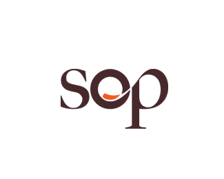
Description:
Logo for online and printed food and drink magazine. The company will also offer high end private cooking courses.
Status:
Nothing set
Viewed:
5131
Share:

Lets Discuss
Very interesting logotype. The 'O' seems a tad bit too heavy in my opinion. While it might be the same weight as the thickest points in the P and S, because the P and S have thin areas, you should compensate slightly. Cheers.
Replynice concept %26 looks interesting, but I agree with ocular Ink about the %22o%22.
ReplyI totally agree, it looks heavier. I kind of decided for it to stand out just a bit more because the o will be used by itself too, and looks pretty solid at that weight. The symbol will be used alone since the word sop is the origin of the word soup in many languages, and means to use a piece of something to %22sop up%22 a liquid. **
ReplyPlease login/signup to make a comment, registration is easy