Generation Diversity
by mobi • Uploaded: Feb. 07 '08

Description:
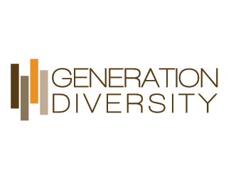
This logo was created for a diversity recruiting firm based in Chicago.
The four bars are to signify different races. We did not use faces or figures because the client wanted to be open to both males and females and didn't want there to be any confusion.
As seen on:
Generation Diversity
Status:
Nothing set
Viewed:
1818
Share:

Lets Discuss
I like the simple mark and color choice. The type could use some work (kerning for one) ... I'm thinking different type in general might be better. Not sure what though...
ReplyPlease login/signup to make a comment, registration is easy