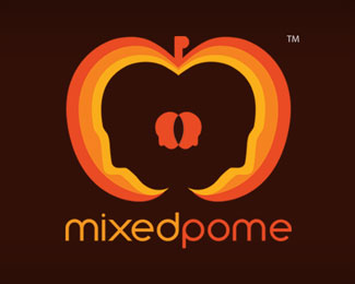
Description:
The core concepts behind the logo
We wanted a logo that had a the literal meaning of the company name mixedpome
1. The letter m formed in the shape of and apple
2. The letter p formed with the peduncle to give the logo a balance and also to go along with the name mixedpome
3. Usage of an orange color which is an energetic color and also to go along with black and white shades as well
4.The a rounded typography to go along with name and the character of the fruit
5.The two faces mixed together at the core feeling it a feeling of a pip and that gives a weight and balance to the figure
6.The pome cut in such a way that two faces are formed and also to show us that we are creative and also we provide quest for achieving acquiring one’s dreams
Status:
Client work
Viewed:
1273
Share:
Lets Discuss
Please login/signup to make a comment, registration is easy