Description:
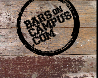
The logo needed to be simple and recognizable. I started with a beer bottle stain in a napkin, and worked from there. Bars on Campus brings college bars and students together thru an online social network. BOC provides a social atmosphere for college students to view what's going on, share it with their friends and partake in events and promotions within their campus area.
Status:
Nothing set
Viewed:
2103
Share:




Lets Discuss
I think this is a great start. My only issue with it right now is that the %22dot%22 gets lost, and the %22.com%22 as a whole just doesn't feel important enough to be on its own line. I wonder what you can do to make it so the logo reads %22Bars on Campus%22 with %22.com%22 kind of more as an afterthought on the right side of the name, but still inside the ring of course.
ReplyPlease login/signup to make a comment, registration is easy