Description:
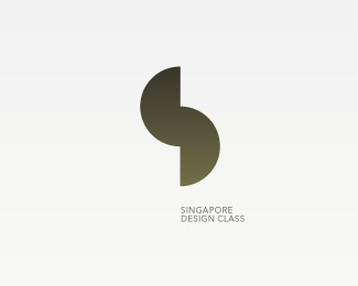
a quality mark for Singapore Designers, initiated by the Design Association of Singapore. Requirements: recognizable in very small sizes and in one color. This mark is an S, made up of a D and C. WIP. Created while working for Equus Brand Consultants Singapore.
Status:
Unused proposal
Viewed:
2778
Share:

Lets Discuss
Don't worry about the size of the text, it's just for presentation purposes. When this is used as a signature on the different design studios name cards and letterheads, the text will obviously much bigger.
Replyyea I like this
ReplyThough it reminds me a lot of the Moving Brands logo, I really like it!
Replythanks cake_sama and m1sternoname, I love Moving Brands so there's probably some unconscious inspiration going on there. The logo I posted as %233 has even more similarities, now that you've mentioned MB. This one came out best in the presentation, and is my personal favorite at the moment. Works well in really small sizes too, which was a very important requirement.
ReplyTruly Mister Jones!
ReplyYo MJ, my man! :) Love all your concepts, just a tiny observation here. Using this geometry style did you maybe find a way how to show letters in the order? Most of these show C first and the D which would mean Singapore Class Design (not bad at all but a wrong message). I know that's the problem when using it for the structure of the S letter but this order thing is a bit off and might not be readable without the association name next to it... JMO...
ReplyYo MJ, my man! :) Love all your concepts, just a tiny observation here. Using this geometry style did you maybe find a way how to show letters in the order? Most of these show C first and then the D which would mean Singapore Class Design (not bad at all but a wrong message). I know that's the problem when using it for the structure of the S letter but this order thing is a bit off and might not be readable without the association name next to it... JMO...
Replyyo type08, good observation. Have thought about this but didn't see this as a big issue since most people won't notice that the S is made out of a D and a C, they'll just see the symbol, and maybe the S in it. Client had no concerns about this too. I resolved this %22problem%22 in version %233 by adding the D and the C after the S, but it's a bit too long and heavy to be used in small sizes.. check it out %26 thanks for the nice words :)
ReplyYea you don't need to be deliberate all time :). This one is Minimalism at its best IMO.
Replycheers dbunk, nice compliment :)
ReplyI like this 5)))
Replythanks lefty %26 bddesign
ReplyVery nice. I actually read it as SDC. I found the eye follows the curve of the S which leads to the D which in turn jumps up to the C.
Replybeautifully simple Mister Jones... as with all your work... very nicely done!
ReplySimple coolness!
Replythanks everyone for the great comments!
ReplyI like this. It's nice how all 3 letters can be present at the same time. Nice idea.
Replyoooh thats so nice
ReplyPlease login/signup to make a comment, registration is easy