Description:
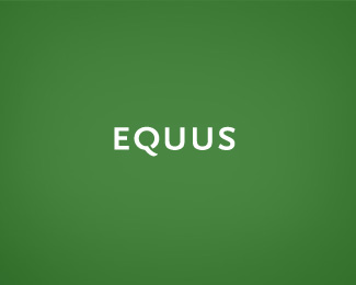
new logo for Equus Brand Consultants Singapore. Intentionally kept very simple to allow brand expressions in many different styles. Created while working for Equus Brand Consultants Singapore.
As seen on:
www.equus-design.com
Status:
Client work
Viewed:
9676
Share:

Lets Discuss
I love it.. Is this font based on DH/Metro sans? It looks like it by the S. I love the Q! Good job..
Replythanks man, every letter is customized and based on different types, and i'm guessing metro sans was one of them. I'll check my source files tomorrow and if you're right, you got a damn good eye for typography. Although it looks very simple, it still took me very long to get it right and exactly how I wanted it to be.
ReplyThis is classic. This would stand the test of time and last for decades. Nice.
Replyyes , very stylish typo here
ReplyLooks good. But the width of the 'Q' is bothering me though.
ReplyI think it would look more awkward if the 'Q' was any more condensed... I love it for its grace in simplicity.
ReplyThis is indeed quite lovely. I think the Q is perfect but I can't help thinking the pair of U's are just a smidgen too far apart.
ReplySo simple but so elegant! I absolutely love it.
Replygreat, timeless structure.
Replyif you go to www.cpluv.com right now, you'll see this logo on top of the page**: )
Replythis logo rules... :-)
Replysimply perfect
Replyexcellent!
ReplyThis is really nice looking man.
ReplyPlease login/signup to make a comment, registration is easy