by mishdogg • Uploaded: Jan. 15 '08
Add to Pad (In 1 Pad )
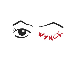
Description: Wynck Status: Nothing set Viewed: 1304 Share:
Would be cool to just take the eye lash line and put in under the %22wynk%22 part. Don't need any additional graphics.
The icon is nice... a bit sad, but nice. What's it for?**I don't care for the type choice. It doesn't seem to fit.
The blue to black fade in the hair is nice, but it doesn't seem to work when mirrored in the font choice. I'm with ryantoyota on the font choice too.
I kinda like the font. It will fit better with the icon if perhaps the black line around the face were thicker. Yeah, the gradient in the type is out of place.
Please login/signup to make a comment, registration is easy
Follow
")

Lets Discuss
Would be cool to just take the eye lash line and put in under the %22wynk%22 part. Don't need any additional graphics.
ReplyThe icon is nice... a bit sad, but nice. What's it for?**I don't care for the type choice. It doesn't seem to fit.
ReplyThe blue to black fade in the hair is nice, but it doesn't seem to work when mirrored in the font choice. I'm with ryantoyota on the font choice too.
ReplyI kinda like the font. It will fit better with the icon if perhaps the black line around the face were thicker. Yeah, the gradient in the type is out of place.
ReplyPlease login/signup to make a comment, registration is easy