by milash • Uploaded: Jan. 16 '09
Add to Pad (In 35 Pad s )
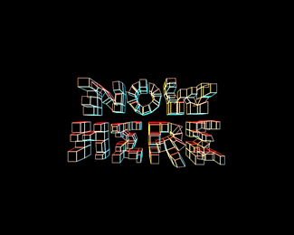
Description: just seven Status: Just for fun Viewed: 14751 Share:
This is cool! You don't even need the gradient. It %5Bthe gradient%5D actually kills it! Nice simple concept..!
i think you r correct. it looks better now. thanks*
Much better in this color combination. **The part where left E meets 7's stroke seems a bit cluttered and unbalanced though .. just as if the stroke needs to go a bit higher and/or its curvature needs to be increased.
it's perfect
kool!
thanks guys.**how about this one eps.
Very good.
%5E heh. David, try to rotate your head :)
clockwise :)
Sweetnes!
almighty Helvetica %3B)
divine
cool!
thank you citizens of the world
great!
thanks everybody
congrats on the featured!!!! n_n
Super clever mate. It's one of those %22Why didn't I think of that?%22-ideas :-)
known, but perfectly done
Genious!
That V is amazing
Excellent
Please login/signup to make a comment, registration is easy
Follow


Lets Discuss
This is cool! You don't even need the gradient. It %5Bthe gradient%5D actually kills it! Nice simple concept..!
Replyi think you r correct. it looks better now. thanks*
ReplyMuch better in this color combination. **The part where left E meets 7's stroke seems a bit cluttered and unbalanced though .. just as if the stroke needs to go a bit higher and/or its curvature needs to be increased.
Replyit's perfect
Replykool!
Replythanks guys.**how about this one eps.
ReplyVery good.
Reply%5E heh. David, try to rotate your head :)
Replyclockwise :)
ReplySweetnes!
Replyalmighty Helvetica %3B)
Replydivine
Replycool!
Replythank you citizens of the world
Replygreat!
Replythanks everybody
Replycongrats on the featured!!!! n_n
ReplySuper clever mate. It's one of those %22Why didn't I think of that?%22-ideas :-)
Replyknown, but perfectly done
ReplyGenious!
ReplyThat V is amazing
ReplyExcellent
ReplyPlease login/signup to make a comment, registration is easy