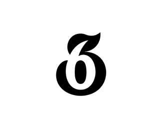
Description:
36
Status:
Unused proposal
Viewed:
6093
Tags:
bokhua
•
george
•
milash
•
36
Share:





Lets Discuss
Killer use of negative space. And great styling to boot.
Replythanks notjelly. comment much appreciated.
ReplyBeautiful. I agree with notjelly on your use of negative space. It's a shame this went unused.
ReplyGreat logo, lovely style!
Replynice 3,6 combo. beautifully done.
ReplyI predict 36 floats. Cool work.
Replythanks good old friends.
ReplyBoy that's solid.
Replythanks logoboom
Replypretty clever milash !!
ReplyMy kind of logo. Nice one George.
Replythank you fellas. glad to see you again :)
ReplyNice number twist .
ReplyA thing of beauty.
Replyvery clever
ReplyI see a rubber duck in there too!
Reply:D good one herbert. thanks guys.
ReplyMe megona V6...
Reply:)
V.
Absolutely lovely.
ReplyFrom a distance I thought it was '65', but I see the '36' clearly now.
good idea
Replysexy
ReplyAnother beautiful use of negative space
ReplyPlease login/signup to make a comment, registration is easy