Float
(Floaters:
6 )
Description:
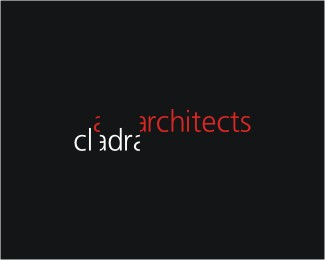
logo for an architectural company
Status:
Client work
Viewed:
4049
Share:



Lets Discuss
Very interesting. A little difficult to read at first, but very unique wordmark. Perhaps a thicker font would help readability?
Replyyou're right about that koodoz :) for the first idea I used a thicker font ... but this is the final version :D
ReplyA little difficult to read, yes, but that's a smart idea. Have you tried positioning the architects ( all the red ) part below cladra? Just wondering.
ReplyPlease login/signup to make a comment, registration is easy