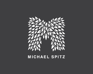
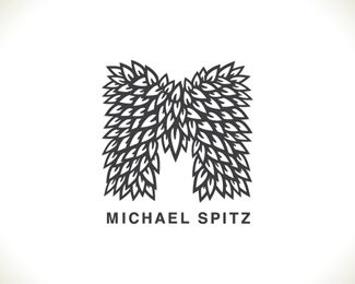
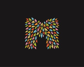
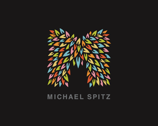
CLIK WING
by michaelspitz • Uploaded: Sep. 04 '09

Float
(Floaters:
3 )
Description:
Unused mark exploration.
Status:
Unused proposal
Viewed:
1,863
Share:
Lets Discuss
I like this one too.
ReplyAppreciate the feedback on these guy's! :) I'm trying to decide on a primary mark...leaning towards the angled guy, but this is the original and works as well... Thanks again for the comment!
ReplyLike this option better...good one
Reply@libran005 - Cheers! Thanks very much for the input!
Replylove it %3B) good work
ReplyMichael, I really like your Samurye logo, but this one is weak. It feels like one of those logos that picks two words, forces them together and _then_ tries to explain what the concept could be. It is ass-backward, the concept must come first.
Reply@regnum - Cheers! Thanks very much! :)**@epsilon - A pretty rough review no doubt...but of course you're entitled. %3B) To be honest, this guy's always felt pretty iconic to me. While it's certainly still open for improvement, I worked it over a number of times, and I personally see the 'web-flight' concept showing through pretty strongly. So, I can't say I necessarily agree with you, but I certainly appreciate the input. :)
ReplyPlease login/signup to make a comment, registration is easy