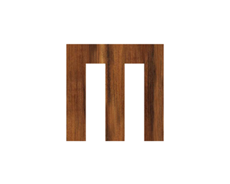
MS Monogram
by michaelspitz • Uploaded: May. 16 '10

Float
(Floaters:
20 )
Description:
Personal mark exploration from the archives.
Status:
Unused proposal
Viewed:
5,728
Share:


Lets Discuss
yah this is nice :) got a good retro type feel - would love to see the type
Replythis is beautiful!
Reply@brandclay - Thanks a lot Sean! Never actually worked up type for this guy %3E Just one of the many 'MS' variations I've worked on over the years... %3B)**Perhaps a nice project application will pop up...but in the meanwhile I'll put some thought into some good complimentary type. Cheers!**@birofunk - Thank a bunch Niall! :)
ReplyThis one is so beautiful and elegant!
Reply@krinimal - Thanks so much!
ReplyNice, haven't seen this. But your current M is definitely the most powerful choice. This is nice, bet it looks even better on a smaller size.
Reply@Lecart - Thanks a lot! Certainly not considering an ID shift...%3Cbr%3EBut this is one of my fonder 'MS' iterations I've played with over the years...%3Cbr%3EAs far as scaling %3E it does in fact tend to shrink down pretty well %3B)**!http://farm5.static.flickr.com/4018/4611835195_8fa8529600_s.jpg!
Reply@Type08 - Ha! %3B) Thanks a bunch Alen!
Replyoh my god, great!
Replythis is some amazing work!
ReplyLove this, Michael! Just curious, why not to join the MS? i think you have tried :D
Reply@allanyoung / megashred13 / Bitencourt - Cheers guys! Thanks a bunch! :) @Breno - Played around with linking the whole thing up...but decided to leave them as separate components in the end (intertwined yet individual) %3B)*
ReplyAwesome MS! Love the mono.
Reply@JoePrince - Thanks a lot Joe! Much appreciated! :)
ReplyPlease login/signup to make a comment, registration is easy