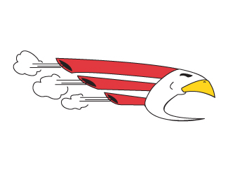
I agree that it is far too busy. It looks like clipart. To many this might sound like the worst insult, but to me it isn%B4t. I don%B4t think I%B4ve ever seen a technically bad piece of clipart. The point is that clipart is always trying to be as obvious as possible, while logo creation (IMHO) is the art of reduction.%0D*The drawing is great in many ways (style, composition, colors), but when usability is one major factor, there is no way so many (useless) details like in the corn end up in a logo. %0D*This might become very good (trustworthy, down to earth), but it isn%B4t there yet.


Lets Discuss
very bad example, so overcrowded, too complicated
ReplyI agree that it is far too busy. It looks like clipart. To many this might sound like the worst insult, but to me it isn%B4t. I don%B4t think I%B4ve ever seen a technically bad piece of clipart. The point is that clipart is always trying to be as obvious as possible, while logo creation (IMHO) is the art of reduction.%0D*The drawing is great in many ways (style, composition, colors), but when usability is one major factor, there is no way so many (useless) details like in the corn end up in a logo. %0D*This might become very good (trustworthy, down to earth), but it isn%B4t there yet.
ReplyPlease login/signup to make a comment, registration is easy