Description:
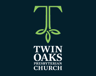
Twin Oaks wanted a logo that communicates their roots in orthodox doctrine, their Scottish Presbyterian heritage, and their commitment to building strong community both in and out of the church.
Status:
Nothing set
Viewed:
9085
Share:
Lets Discuss
Nice. It's awfully tall but....nice.
ReplyLike the Trinity in roots and the Celtic look of the roots... *Agree with gthobbs... it's tall all right.
ReplyDefinitely is a tall one, but I could see this translating well into corporate stationery. The mark could still use a bit more attention regarding execution ( mainly the bottom area ), but still, this is very nice.
Reply%22The mark could still use a bit more attention regarding execution ( mainly the bottom area)%22...**Would you care to elaborate? Are you talking about the roots in the mark? That was given a lot of attention...I'm not sure how it could be improved, my boss and I went around and around with this one. The goal was to make the knotwork look like it was originally intended to be part of the letter. I started out with geometric shapes and then flattened or accelerated some of the curves to make it a bit more natural.**As to the height of the logo, that was intentional. We wanted it to feel transcendant, as well as architecturally mirroring the incredibly tall steeple that makes the church a local landmark.
ReplyPlease login/signup to make a comment, registration is easy