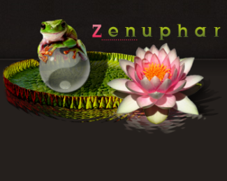
Description:
My 'enterprise name' as a web designer is : zenuphar.
It's the contraption of words 'zen' and 'nenuphar' (water lily in french).
The lily pad is a metaphor about web sites that float around on the 'web pond' and, when their are beautiful and clear, that attract frogs-visitors .
Status:
Nothing set
Viewed:
1540
Share:
Lets Discuss
There is just too much going on here. Everything is way too detailed, if you shrink it down, it will look like crap. The water effect is unnecissary, and the bright flower draws the eye. Considering you were trying to focus on the lily pad %26 zen concept, the flower simply detracts from it.
Replyawesome graphic, but WAAYYY too much for a logo...maybe try a one/two color simplified illustration? just a thought.
ReplyThanks for your comments.*Actually I shouldn't have posted it here because it's not really a logo, it's more a header.*Check my website, it's designed to fit with the whole site but it hasn't be thought as a logo the way it is intended here (brand names, ...).*In 2 month or 3 I'll redesign my website in a totally different way (more sober) and I'll make a real logo %3B) **I learn a lot about logo design in here, there are great designers around.**Best regards.
ReplyPlease login/signup to make a comment, registration is easy