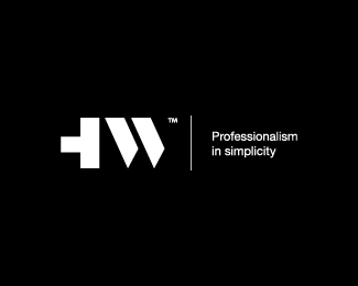
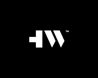
Hiletswork
by melvynpau • Uploaded: Nov. 14 '18


Float
(Floaters:
6 )
Description:
My own logo design with stand for "Hiletswork".
Status:
Client work
Viewed:
2173
Tags:
Design Studio
•
Agency
•
Modernism
•
Typography
Share:


Lets Discuss
This is nice! In most cases I think the TMand R symbols are totally useless in a logo design - they end up looking like a speck of dirt on your screen - however, you did an excellent job incorporating it into the W's serif.
Replyslick!
Thank you very much for your comment. I really appreciate it!
ReplyPlease login/signup to make a comment, registration is easy