by mdac • Uploaded: May. 12 '08

Float
(Floaters:
3 )
Description:
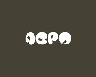
My portfolio logo. A two-color version.
Status:
Nothing set
Viewed:
1974
Share:


Lets Discuss
Interesting idea but difficult to read.
ReplyFeels kinda like a brain, which is interesting. But would indeed need other type to support the name.
Replywow - that took a lot of thought and planning. I like it, but it is difficult to read, as firebrand said. If you just want it to look interesting and then explain it to people, you've hit the mark (no pun intended) :)
ReplyDefinitely can't read it.
ReplyReadability suffers!
Replycant read but intriguing ... love it
ReplyPlease login/signup to make a comment, registration is easy