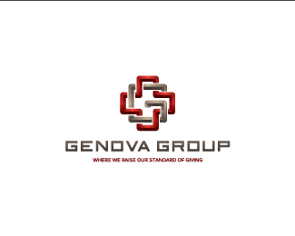
The monogram is clever. I also agree that it would be stronger without all of the effects. With them, it makes it look like a 3D pipe which could give the first impression of something related to plumbing.
^Agree with everything said. A brilliant mark wasted by effects. Why don\'t you try experimenting with just shadows where the lines intercept. Or try using just darker or lighter tones of flat colours.


Lets Discuss
I see the G & medical plus - cool
Replyawesome mark, again. bad gradated text, again. :P
Replythank you all!
Reply\"bad gradated text\" :) do you have any suggestion for the text?
I\'m still working on this logo so all feedback/criticism are welcome.
The monogram is clever. I also agree that it would be stronger without all of the effects. With them, it makes it look like a 3D pipe which could give the first impression of something related to plumbing.
Reply^Agree with everything said. A brilliant mark wasted by effects. Why don\'t you try experimenting with just shadows where the lines intercept. Or try using just darker or lighter tones of flat colours.
ReplyI like this one :D
ReplyPlease login/signup to make a comment, registration is easy