Description:
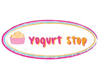
This logo was designed for a project where we as students had to pick a business and personally ask them if we could re-design their logo. The company I picked is a self-serve frozen yogurt company in my hometown called Yogurt Stop. The logo they have in use now is, in my opinion not "catchy" enough and very generic. I feel the logo I've designed could possibly fit the look and feel of Yogurt Stop much better.
Status:
Unused proposal
Viewed:
877
Share:
Lets Discuss
Megan, I think the colors are great, they capture the feel of dipping into a fresh frozen treat on a hot summers day. I like the rough strokes around the design. Maybe reverse the colors in %22stop%22 to match %22yogurt%22 to see if it would balance a little better. You Rock!
ReplyYou should reverse the color of stop. Other then that, it's pretty good.
ReplyOverall, I love it. The only thing that kinda %22bothers%22 me is the font for Yogurt Stop seems to clean compared with the rest of the logo, just kinda distracts me a little bit. But like I said overall I love it.
ReplyI like the colors you used and the design itself. Although I agree with the others in that I think the %22Stop%22 would look better with the colors reversed. Other than that, I think that the log is catchy, and successful. Good job.
ReplyThe text is too clean cut. the lines surrounding the logo are rough and even the yogurt logo seems to have the same rough edge feel. Also, I dont like the %22glow%22 behind the text. But, I could totally see it up on a store and I think you did good.
ReplyThis is something that you definitely would see in real world. I think it is a very successful logo, colors and all.
ReplyPlease login/signup to make a comment, registration is easy