Float
(Floaters:
0 )
Description:
practice. need your critiques guys, appreciate it.
CHEERS
Status:
Nothing set
Viewed:
1166
Share:



Lets Discuss
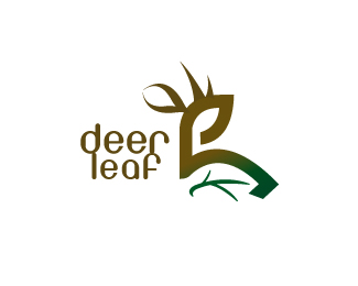
No offense, but I'm not seeing the deer at all. I see his/her ear, but that's it. Your font choice and lockup is kind of weak too. Also, blending from brown to green isn't the best idea - it's going to look muddy in print.
Reply@sdijock**none taken dude :)*but I think with the ear and horns and the whole shape you could see it. I tend to simplify things and make it a little bit vague.**Plz explain why the typeface is weak? And dude..its a PRACTICE and its not going anywhere near a print house :) and if so, I would like it to be muddy, this is the whole point of using this blend, to give it that feel of nature. **Any ways, appreciate the comments and I'll do some experimentation on the typo treatment. Thanx man :)
ReplySorry, still not seeing the deer - but maybe it's just me.**As for the typeface, the style is too modern for a nature logo and it's also too light of a font choice - thus my %22weak%22 comment. You need something bolder and heavier.**And in regards to my comment about the blend getting muddy, you asked for critiques, right? The color issue is part of my critique, whether the logo is for practice or not. **Best of luck with the experimentation. I look forward to seeing updates.
ReplyIt's good I see the deer clearly, I would simplifies the leaf vain and the antlers though.
ReplyLove the deer - very nicely done. The font is a bit rough around the edges but I get why you chose it. Because the logo has more angles and sharp edges it may suit a similar font rather than a rounded font as you have now.**The deer though is great and would work beautifully as a stand alone logo. It reminds me of a logo for a conservation effort.
ReplyPlease login/signup to make a comment, registration is easy