Quad City Mallards (2011)
by mattkauz • Uploaded: Nov. 16 '11
")


Float
(Floaters:
31 )
Description:
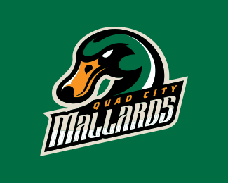
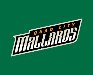
New, updated logo for the Quad City Mallards of ECHL....
View the case study for this project here:
http://studio1344.com/portfolio/quad-city-mallards/
As seen on:
http://myqcmallards.com/
Status:
Client work
Viewed:
10504
Share:


Lets Discuss
I really like the refinement on this one. Congrats on the great work!
ReplyNice solid update to an already great logo.
Replygreat ...
Replycongrats
Replyyour style so good
Wonderful work! Congrats on the feature! Well deserved! :)
ReplyWith looong overdue :) congrats!
ReplyCongrats!! Love your work!!
ReplyAnd a big congrats from me (well deserved)
Replycongrats on the feature! deserved for sure. solid stuff.
ReplyThank you all for the kind words! I was so surprised when I went on the home page and saw my portfolio featured... it's such an honor!
ReplyI guess I should update my portfolio. :)
Please login/signup to make a comment, registration is easy