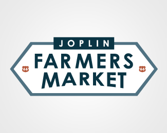
Official Joplin Farmers Market Logo
by matthewtodd • Uploaded: May. 21 '09

Float
(Floaters:
3 )
Description:
This is the final concept that was accepted as the new Joplin Farmers Market Logo
Status:
Client work
Viewed:
4322
Share:


Lets Discuss
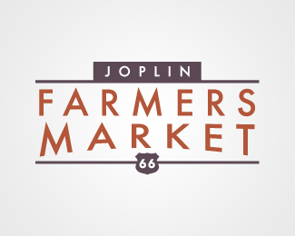
i like this and your other concept that has the distressed look to it. the %22OP%22 spacing is a little odd, makes it appear not as smooth a line.
ReplyPlease login/signup to make a comment, registration is easy