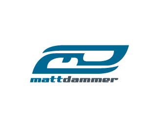
Matt Dammer Logo
by mattdclimber24 • Uploaded: Jun. 10 '09
Description:
My identity logo. The M and D shapes are the same except the M has an added stroke and the D is flipped.
Status:
Student work
Viewed:
669
Share:




Lets Discuss
Please login/signup to make a comment, registration is easy