Description:
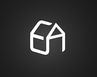
This is a concept for a company who carry out energy assessments on homes prior to their sale. The client requested that the logo contain an image of a house, I have tried to combine the letters 'E' & 'A' (from the company name) to create a house. This design has not yet been submitted to the client so your feedback would be greatly appreciated. Many Thanks!
Status:
Nothing set
Viewed:
12235
Share:



Lets Discuss
That's a very nice concept!
ReplyVery good solution!
ReplyYes, great solution
ReplySo simple, yet so clever - who would have thought?! Well done!
ReplyThe concept is awesome. I would never have thought of something like that!
ReplyVery nice solution indeed. I'd say you are pretty darn good especially considering you are %22fairly new to logo design%22. :-)
ReplyThanks a lot everyone for your comments! It's reassuring to hear that you guys like the design 'cos i wasn't too sure about it myself. **Suggestions on how to improve it will be very much appreciated, thanks!
ReplyGreat concept and execution!
Replythanks everyone!
ReplyReally cool work! Well done %3B)
ReplyI love continuos lines! Very clever and super clean.*
ReplyNice concept!
Replyclass mate, nicely worked letter forms into the house
Replyreally good work
ReplyDamn that's good.
ReplyPlease login/signup to make a comment, registration is easy