Float
(Floaters:
16 )
Description:
2nd concept for world of camping
Status:
Nothing set
Viewed:
2750
Share:

Lets Discuss
great
ReplyThanks!
ReplyI like the mark, I don't think you need the text at that angle though
ReplyThanks birofunk, you may be right about the type
Replyi agree with birofunk love the mark but do think more work could be done with the text
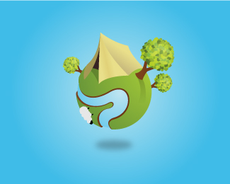
ReplyThis is the updates version, I've changed the type and added more detail to the graphic, what do you think?
Reply*updated
ReplyIs that a sheep? I'd make it a deer, if you can.
Replyyeah it's a sheep. I think i might change it to a deer, thanks undah.
Replyyeah, that sheep makes no sense unless you are camping on the palace grounds (they use sheep to cut their grass). deer would definitely be best (as opposed to creatures campers avoid such as moose, bear, bison, etc.).
ReplyThanks for the feedback theartistt, the logo is designed for a UK company serving UK customers only, and it's actually quite difficult to go to the countryside in the UK without seeing sheep, so I think it does make sense.
Replyyou are right. in that context it does make sense. you could probably change the animal for whatever is local depending on how far this logo goes into other, foreign, markets.
ReplyVery cool illustration! Is that all vector? Wow, good job!
ReplyThanks Lumavine. Yeah it's all vector
ReplyPlease login/signup to make a comment, registration is easy