H1 Tecnologia
by matheuswlima • Uploaded: Jul. 13 '20

Float
(Floaters:
0 )
Description:
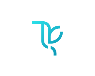
Movement, security and innovation. These are the pillars that the new brand of H1. The icon is the perfect translation of that, where we have the union of the letter with the numeral in a fluid and light form, creating something unique, unprecedented and that manages to carry all the meanings that are interesting to us. The choice of colors follows the premises of color psychology, used in the construction of brands. Blue and green predominate, as they are colors associated with technology, innovation and also security. The use of the gradient suggests movement, progress and new processes. The gradient makes use of the beauty of colors in nature, where pure colors are rare.
With this, we managed to bring an organic touch to the brand. The typography chosen is modern, and also refers to the technology segment. The absence of serifs facilitates reading, even when the mark is applied in reduced proportions. The new brand of H1 Tecnologia is the maximum expression of what a company in the segment needs to transmit quickly: innovation, security and constant movement.
As seen on:
Behance
Status:
Client work
Viewed:
812
Tags:
ti
•
technology
•
tech
•
h1
Share:


Lets Discuss
Please login/signup to make a comment, registration is easy