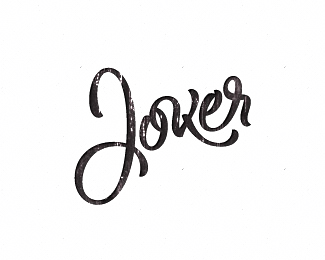
Description:
fun
Status:
Just for fun
Viewed:
13310
Tags:
pavel saksin
•
paul saksin
•
ino
Share:


Lets Discuss
Nice mark :)
Replynice idea and the outcome. good work
ReplyNice idea.
Replyclever and great!
ReplyLike it*
Replyone of my favorite mark in your works
ReplyThanks guys)
ReplyGreat thinking!
ReplyAbsolutely love the idea! i hate to be the bearer of bad news but it has already been done...*http://www.mike-rigby.com/%23663937/Keycutters*sorry master_ino
ReplyDan, unexpectedly, but this http://cargocollective.com/jonathanwoolleydesign/following%23663937/Keycutters date since Nov 12 2011*that my earlier
Replythe link in your comment above is actually to a blog by jonathan woolley who posted the logo on Nov 12, 2011.**The mark was designed by Mike Rigby back in 2004 when he worked for The Chase - http://www.thechase.co.uk/portfolio/project.php?category%3Dlogos%26project%3D11%26pic%3D1 **It has been around for years. Sorry.
Replyit%60s ok always first will not...
ReplySimple, clever approach.
ReplyThanks Todd
ReplyI like it when a logo is clever. There are to many logos where you don't understand what the connection between the image and the company name is. *Great work master_ino.
Replyvery nice
ReplyThanks guys!
ReplyPlease login/signup to make a comment, registration is easy