Description:
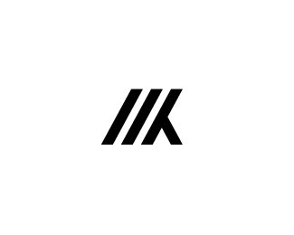
New personal logo. Both initials M and K are in there. I feel like this one is stronger than my old one.
As seen on:
Marvin Kennis
Status:
Work in progress
Viewed:
2444
Share:


Lets Discuss
I like the gestalt typography idea, would be interesting if the negative space could draw something as well. I like your style.
ReplyThanks alot man. Appreciate it. Can't see the negative space forming anything though, without reforming the lines as they are now.
ReplyMade the space between the diagonal stripes a bit tighter. Is it better like this?
ReplyPlease login/signup to make a comment, registration is easy