Description:
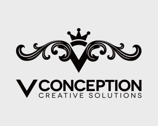
Logo for an Interior Design Company.
Status:
Work in progress
Viewed:
987
Tags:
Interior
Share:
Lets Discuss
I would like to get some professional advice. I really don't like this logo design but after 10 different logo designs this is the logo my client chose. How can I improve this logo?, How I can make it look better?
Replyhttp://logopond.com/gallery/detail/195472
Any advice is greatly appreciated!
It's off balance right now. I wouldn't make the 'V' so large, and then try to center it up.
Replytake the second V out of the text below. loosen up the kerning and center conception a little smaller beneath. choose a slightly more flowing font for creative solutions and center as well. let the embellished V mark be the main part of the logo.
ReplyPlease login/signup to make a comment, registration is easy