Description:
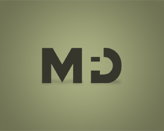
My personal intials, I would like to hear some comments about it.
As seen on:
Status:
Just for fun
Viewed:
2075
Share:

Lets Discuss
Very clever! Nice suttle shading too, well done.
ReplyIt took me a while to see the reversed out F. At first glance I saw MiD. Great concept though.
ReplyI really really like this.
ReplyI like this a lot but agree that it may read MiD. The forms that are created out of the D by the reverse knock out of the F are pretty distinctive and seems to cause some confusion. It's a nice clean execution that has me intrigued but I'm not sure if it can't be played with further some how.
Replyif i didn't know any better i'd say it read MiD...try a stroke to outline the shape of the F to make it more distinguishable...or maybe even a cast shadow on just the F
ReplyI read MID.
ReplyAgreed. I saw MiD and thought 'wow that should be kerned better.'
ReplyThank you all for the comments and advice, they are really usefull and I'll try to see what I can do about it
ReplyFirst I saw MID too..check this logo: www.bbn-international.com , its the same concept
ReplyHi, very nice logo, i like this very much, in this i am seeing two words, one is every one saying as %22MID%22, and one more i am looking as %22MFD%22 also, please have a look,
ReplyPlease login/signup to make a comment, registration is easy