Float
(Floaters:
13 )
Description:
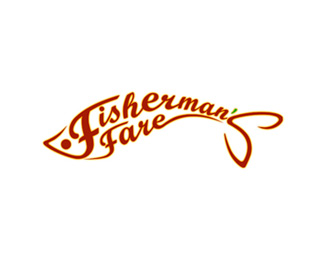
Logo for seafood restaurant.
Status:
Nothing set
Viewed:
5737
Share:
Lets Discuss
really nice job!
ReplyYeah be nice to form the e in fare back to the fin.
ReplyWhat logomotive said...and I'd lose the color break on the apostrophe.
ReplyNice! same as LoGoBoom, I would make the apostrophe the same color as the rest.
ReplyI guess a small prelude about the logo will clear all your queries. The client is a speciality South Indian restaurant and, around here, seafood boasts rich garnishing and spices. Hence the green apostrophe (to cue mint leaves) and the faint outerglow to give a hint of the oil. Hope I've made my point clear%3B-)
ReplyI'd still lose the green.
Replythen maybe it's the amount of green. i notice the fish doesn't have any fins (like a dorsal fin), maybe you can use the fins to highlight the green? Otherwise, the green does not have a strong enough presence to warrant it being in the design, IMO. I really like the concept :)
ReplyPlease login/signup to make a comment, registration is easy