Description:
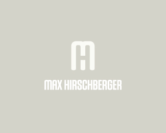
Logo for Glasgow-based model Max Hirschberger.
As seen on:
mabu.dk
Status:
Nothing set
Viewed:
5377
Share:

Lets Discuss
very nice, I like it, I done something similar.**http://logopond.com/gallery/detail/92240
ReplyCheers man. Love your concept too. I don't want anyone to get the wrong idea, so I might bring this sucker down.
ReplyCheers man. Love your concept too. I don't want anyone to get the wrong idea, so I might bring this sucker down.**There's no need to do that Mabu, all I was pointing out really that this use of negative space can work on the M and H. They are both different to hold their own, its a big world plenty of room for everyone!
ReplyHere was my M H http://logopond.com/gallery/detail/111515
ReplyGreat mark my friend!
ReplyNoble thoughts, Paul. Thank you.
ReplyThanks a bunch Harris and Ali. I'll darken the background soon.
ReplyPlease login/signup to make a comment, registration is easy