Punky Munky
by m_molloy • Uploaded: Aug. 10 '09

Float
(Floaters:
4 )
Description:
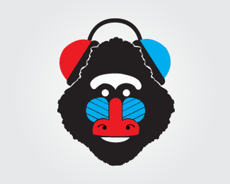
Logo for a record company. Chose the baboon for its iconic face and because it is know to be a loud, wild monkey, which is suitable for a record label that represents rock music. Mark is meant to be able to stand on its own as well. Stay tuned for a link of how it is used and branded.
Status:
Just for fun
Viewed:
2156
Share:
Lets Discuss
like it, just one tweak: a more %22grungy%22 type could make it a little edgier IMO.**nevertheless great job :)
Replythanks reindeer. I thought about that but I decided I like the cleaner type coupled with the vector illustrative mark.
Replygreat mark, love it! i like the font, but not so sure about the ky overlap.
ReplyThanks gyui. The k was initially very strange looking almost like an H with the tip cut off. So I customized it a bit. I thought that the current arrangement pulled the y in nicely into both words.
ReplyPlease login/signup to make a comment, registration is easy