Float
(Floaters:
25 )
Description:
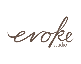
Hand-rendered type created for freelance design studio
Status:
Client work
Viewed:
12443
Share:





Lets Discuss
Very nice flow on the word %22Evoke%22 not sure how well the %22studio%22 text is working. I would suggest looking for a new font. Overall, well done.
Replygreat fon work typography
ReplyLove what you did with your hand-rendered typography. Very well done. I don't mind the 'studio' type...maybe it could be slightly heavier in weight.
ReplyI agree with doc4 about the %22studio%22 type. really like the %22evoke%22*
Replyvery bold, although a little consistency between the two %22e%22's would help. And really, use some sans for %22stufio%22 - like Gill Sans light, for example.
Replyi like the typeface for %22evoke%22 but regarding %22studio%22 i am not sure.**Good job mate!
ReplyI love it. Beautiful work.
ReplyNice flow, nice!
Replylove the type
ReplyPlease login/signup to make a comment, registration is easy