Description:
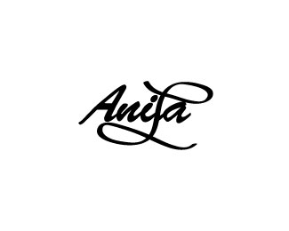
I tweaked the L I drew and made the brush stroke bigger in the others it looks a little skimpy I really want the L to look the same weight as the brush script I altered a little.
Status:
Work in progress
Viewed:
1781
Share:


Lets Discuss
it would look better if letter %22l%22 would be more readable...
ReplyOk I guess add the white space like the A's would help?*Thank u will tweak it.
ReplyPlease login/signup to make a comment, registration is easy