Description:
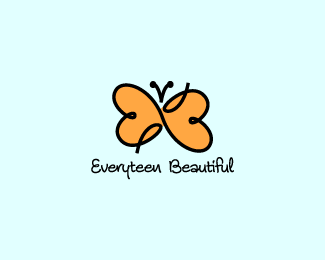
Trying out this doodle-style a bit. It's well-balanced, sizable and has perfectly matched type. There are subtle hearts in the wings as well as the letters E and B.
Status:
Client work
Viewed:
10018
Share:



Lets Discuss
I really like the ambigram EB mark. The type is nice being a perfect match stylistically, but I wonder if the stroke weight should be a little closer. The type gets lost at that size and weight, and doesn't look balanced with the mark.
ReplyFresh mark.*The part that could be refined are where the orange is not enclosed in black.*Font on bottom should be looked at some more.*
ReplyI agree, I think a lot more people should look at the type. It's a beautiful font.
Replybuena idea y buen resultado (solo las antenitas un poco mas redondeada la parte de abajo y menos gruesa a mi parecer se veria mejor) saludos%0D*
ReplyGracias, mentelibre! S%E9 lo que usted significa acerca de las antenas. Yo lo fijar%E9.
ReplyHow did I miss this one, love the colors and style. The typography is very nice.
Reply%3C3 %3B)
ReplyVery nice Jared - it's got a lovely light feeling to it.
ReplyI just worked on a wedding logo, and one of the options included a butterfly mark constructed from the letters E and B. I'll have to post it up. No worries, though, they are completely different. %3B-)
ReplyWell, you know what they say - great minds think alike :D
ReplyPlease login/signup to make a comment, registration is easy