Description:
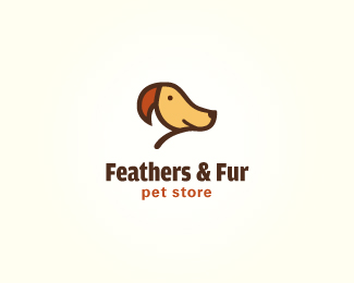
Feathers and Fur. You should see both the dog and the bird in the mark. What you see first is not important, rather, I wanted to viewer to take a second look at it. For this version I have removed the leaves/collar so as always, comments are welcome.
As seen on:
golumo.com
Status:
Work in progress
Viewed:
35860
Share:

Lets Discuss
Definitely like it without the leaves, nice one James.
ReplyYep, better minus the leaves. Looking good :)
Reply@joe, @michael - thanks guys.**I'm just wondering if the bird is as easy seen as easily as before. This version seems cleaner and also has only three colors now.
ReplyIdea - if you put one leaf to hang from the branch it might also look as a dog tag! By the way, I kind of see that my 'Fetcher' logo was maybe a source for inspiration here, am I right? :)
ReplyHi type08, I did initially have the leaf hang from the branch like you suggested (as the dog tag) but as joe and michael said, they prefer this version without. It's a little cleaner and also just used the three colors instead of adding the green too.**As for inspiration, the idea of the combination hit me out of the blue while sketching, and I never actually looked at other designs for inspiration prior to drawing. Unless it somehow had a subconscious impact here...
Replygreat work, Lumo :) both of them is easy to see!
Replyleaves gone, the logo is on!..got better fo sure
ReplyAll good man, I just had that feeling, no probs at all. Well, I didn't see the first version of it but I also didn't mean to go with the green here (a brown leaf would suffice). I think that it wouldn't make it more complex but it would def add a little bonus to it...
ReplyVery nice logo! Love it. Also like it without the leaves.
ReplyThanks for the comments! Cheers.
ReplyShould be in the gallery. Maybe tomorrow %3B-)
Replyhehe, nice dogobird :)
Replyamazing work buddy...
ReplyVery cool, ha, ha!
Replyvery cool!%0D*At first a dog, then a bird )
ReplyClever
ReplyGood idea. Nice colors. Thumb Up.
ReplyI see this is puppi's head %26 also see the parrot
ReplyThanks. Nice to see that the mark works like it should.
Replygreat concept and execution, James.
ReplyNice to see this in gallery. Very clever.
ReplyCute. How to work in the feather?
ReplyThat's great, I actually saw the bird first!
ReplyGENIUS.
ReplyGreat work James!:)
ReplyAppreciate the kind words.
ReplyYes very clever. Took me a while to see bird, I think because of the small dot for eye.
Replygreat concept *check*, great execution *check*, great looking *check*
ReplySheer brilliance!
ReplyGreat and better without leaf
ReplyTook me about 50ms to see the bird and another 2s to see the dog. Great idea and execution!
ReplyThanks midgar. You are on top of your game today! Nice that you caught everything quickly. Cheers!
ReplyWell done, I love it.
Replyi love this. Great work mate.
Replywow!! this is very2 clever!! i like it so much!!
ReplyReally clever and looks great!
ReplyI LOVE smart logo like this one!! but imo becos the birds beak colour is much more stronger, thats where my eyes headed first, i definetly see a bird first. love the simple execution!! Respect
ReplyThanks everyone for the comments.
ReplySo clever! Great work I definitely looked twice.
ReplyVery clever, had to take a second look. Just stumbled on this site some really excellent artwork.
ReplyThanks for commenting. Cheers.
Replygenious!
ReplyVery clever!
ReplyYour logo is currently on the front page of Reddit!
Replyhttp://www.reddit.com/r/pics/comments/tfsij/this_logo_blew_my_mind/
Kind of strange to see this logo here so often and then see it at the top of a completely different website I visit every day!
One of my favourite logos of all time
ReplyPlease login/signup to make a comment, registration is easy