Description:
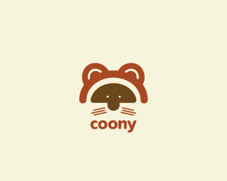
wip...children's clothing. not quite settled on colors yet, but the idea is there.
Status:
Work in progress
Viewed:
5472
Share:
Lets Discuss
Great work! I like it a lot. Perhaps a little more space between the whiskers or a smaller stroke. maybe have them fan outward a bit. Something about them is bothersome. I think its 99%25 there.
Replythanks nickhood. updated.
ReplyAwesome mark! Just one thing in the type, the y seems too close to the n in comparison with the other letters. Great feel overall %26 well suited to the subject
ReplyThis is well drawn, I love the horizontal break. In terms of colour, have you tried contrasting the eye area with the rest?...raccoons are best known for their black eyes.**I think you can get more playful and attentive with the type
ReplyI see that you have updated this -- looks more coony now :D A great refinement.
ReplyThanks clairec and raja for the comments. Updated with mask and customized the type. **Are the colours suitable for the job here?
ReplyI'd go with bigger type -- what age group of kids is this targeting?
ReplyCurrently the type is aligned with the 'mask' as you can see. Thinking of age 3-8 ish. around there.
ReplyAs usual, nice logo James. Catchy and clean, I like it.
Replythanks thomas.
ReplyPerfect!
Replya
Replythanks nickhood and logoses
ReplyPlease login/signup to make a comment, registration is easy