Description:
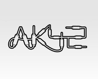
Logo for a Commercial sound & music Freelance producer for TV, Advertising, movies etc.
Status:
Nothing set
Viewed:
3432
Share:


Lets Discuss
Do you see the keyboards key formed by the L and i ?
ReplyIt would have been more legible if you'd aligned their bases. In reading, eyes always flow with the baseline. And the spacing is a bit too tight(?).
ReplyPlease login/signup to make a comment, registration is easy