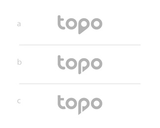
Description:
Alright guys, need your help here. Client and me are undecided atm.
What's your say? a, b or c?
a)
Pros: Simplicity, balance, coherence, clear pin icon
Cons: Letter P not readable 100% at first glance rather in the whole sentence. Icon is not unique when looked at alone.
b)
Pros: Readability improved, letter P is clear, unique pin P icon
Cons: Slight clash with rounded-sharp elements, coherence and simplicity lowered
c)
Pros: Readability improved, letter P is clear, unique pin P icon
Cons: coherence and simplicity lowered
Status:
Work in progress
Viewed:
1292
Tags:
poll
Share:
Lets Discuss
Alright guys, need your help here. Client and me are undecided atm.
ReplyWhat's your say? a, b or c?
a)
Pros: Simplicity, balance, coherence, clear pin icon
Cons: Letter P not readable 100% at first glance rather in the whole sentence. Icon is not unique when looked at alone.
b)
Pros: Readability improved, letter P is clear, unique pin P icon
Cons: Slight clash with rounded-sharp elements, coherence and simplicity lowered
c)
Pros: Readability improved, letter P is clear, unique pin P icon
Cons: coherence and simplicity lowered
a) - why ? uniqueness counts - simple/unique/straight
ReplyA. Unique and memorable win over everything. Your client needs to understans a logo should make a company stand out over its competitors
Reply"A" is a great logo, other variations are just average. Not just because uniqueness, version "a" also have best visual balance comparing to other two.
Reply...
Looking at other characters ("o" and "p"), horizontal line on letter "t" should be the same thickness as vertical. I think this can give the logo even more balance.
"A" hands down. The others don't read as a location pin.
Reply"A" hands down. The others don't read as a location pin. Very clever and unique.
ReplyJust my opinion,.. but if you make the Pointer P Orange and leave it as is in A that works.
ReplyThe others suck to be frank!
Reply:) mike harsh :) will see to use my best persuasion guns in favor of option a :)
ReplyIn comparison that is :)
ReplyPlease login/signup to make a comment, registration is easy