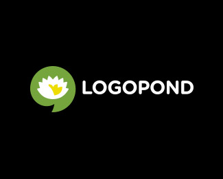
My turn for logopond logo/icon doodle :)
by logoholik • Uploaded: May. 30 '15
")

Float
(Floaters:
8 )
Description:
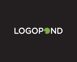
Wanted to see if pond can compete with other similar brands as it is as much as mature if not older than any of them :)
Simplified to the bone with pondpad and L for logo...
Status:
Just for fun
Viewed:
1480
Tags:
logopond
Share:
Lets Discuss
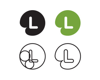
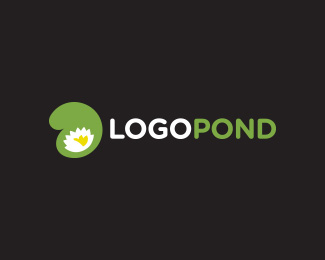
Not bad, but I'm missing the flower. But, the L makes sense when the mark is by itself.
ReplyYes, in broader sense branding wise I think it makes sense.
Replynice one..
ReplyThis is very, very, very, very close to a right direction and it gets my vote compared to your other concepts.
ReplyYep, you're right on both subjects, clock and icon form. This was just exploration, maybe something better arise :)
ReplyPlease login/signup to make a comment, registration is easy