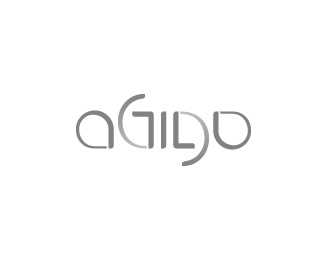
Float
(Floaters:
7 )
Description:
Ambigram proposal for agilo - creative agency
obrni, okreni, agilo :)
Status:
Work in progress
Viewed:
3688
Share:

Lets Discuss
The %22L%22 is a little hard to read!
ReplyThanks Alen. Although it felt perfectly natural for this company to have an ambigram wordmark, the g/l combo is just too difficult to implement while maintaining at least decent readability (i've tried a number of styles, approaches, script lettering, etc... but i end up with odd looking l or g...) On a brighter note, the other suggestion got approved :) Cheers!
ReplyPlease login/signup to make a comment, registration is easy