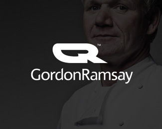
G Ramsay
by logodepot • Uploaded: Oct. 11 '14

Float
(Floaters:
7 )
Description:
created for fun, iconic knife in 'GR' design
As seen on:
logodepot
Status:
Just for fun
Viewed:
2422
Tags:
negative space
•
logo design
•
logo
•
restaurant logo
Share:


Lets Discuss
Still Not cutting it.
ReplyI actually quite like it.
ReplyI know it's for fun, and you're not seeking critique but I want to share my thoughts anyway :)
ReplyFor me, this doesn't reflect the brand that is Gordon Ramsay, at least what he has become. He's no longer just a chef, he's an entrepreneur operating worldwide. I saw him on a TV show about hotels or something the other day. I feel that in a way he has outgrown his image of just being a chef that is known for swearing/cursing a lot.
Having said that, the negative space that the knife creates is clever, but when you look at the image as a whole does it communicate the right message that fits his persona? I'm not sure.
thanks, for me the knife also just communicates his fiery/sharp temperament/personality, which to this day he still retains
ReplyI agree with that, but as a whole this image looks like something I would associate with a racing driver or something. The other one you created is much better, in my opinion.
ReplyI agree the other is better, I can see your point, who knows, as he likes to dabble in new things now other than cooking, he may one day get into racing too then I will have this ready for him!
ReplyPlease login/signup to make a comment, registration is easy