Description:
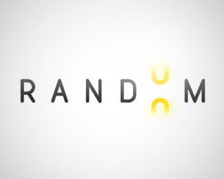
Applies the concept of "luck of the draw" of gambling by incorporating slot machine imagery into the typography.
As seen on:
LogoCafe
Status:
Nothing set
Viewed:
4593
Share:





Lets Discuss
The concept is nice, however there's really nothing random about one _zero_ replacing another _zero_.
Replycouldn't it be like an 8/9 but thats not very random either...actually quite expected... what if it was more like a cherry and banana like the slot machines...those just seem more random maybe? it would add some nice color to it too.
ReplyI think you dont need two differents symbols or letters or anythink that to understand the concept of the logo. However it will reinforce the idea.*Even so Great work!*
ReplyThanks for the feedback! I wrestled with the idea of different shapes - one thing we're doing to expand on this original concept is to use different shapes symbols in place of the 'O' that are relevant for the different child companies. I might do another revision to test out some other numbers / symbols for this main one though.**Thanks again!
ReplyWell, does it have to be a different number? Is the colour scheme set to two? Could it be a grey or different colour to set it off?
ReplyPlease login/signup to make a comment, registration is easy