Supply and Demand at the Warhol
by llevine • Uploaded: Sep. 11 '13 - Gallerized: Sep. '13

Float
(Floaters:
15 )
Description:
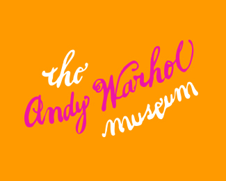
Proposed logo for special exhibition at the Warhol for Shepard Fairey's supply and demand.
As seen on:
None
Status:
Unused proposal
Viewed:
5090
Tags:
•
Urban
•
Design
•
Logo
Share:


Lets Discuss
Is this suposed to resemble Andy Warhol?
ReplyI probably wouldn't suggest using the inspiration and execution of something so iconic that is 'Obey' for a design that is meant to promote the works of someone so profoundly artistic. I think Mr Warhol might turn in his grave.
Reply@Ideoma...Yes, it is a stylistic interpretation. It's difficult to capture a person's true likeness in this style.
Reply@chanpion...Thanks for the feedback.
ReplyI agree with @chanpion.
Reply@joshjevons..This was meant to show that Shepard was taking over the Warhol with his exhibition, mainly by mimicking the bootleg branding he showcases on his website. It was in no way meant to represent Warhol other than it be location based, being that this event was hosted by The Andy Warhol Museum. Additionally, Shepard seemed to agree with me. He did his own version of this after seeing my concept. You can see the final piece at the link below.
Replyhttp://www.freshnessmag.com/2009/10/16/warhol-museum-x-shepard-fairey-shepard-fairey-supply-and-demand/
Ok now I get it. I see the intent and purpose of your design now. My apologies. Got abit sensitive being a Warhol fan. Thanks for the update Larry and great inspiration for Shepard. But damn, he nailed it in his version!
ReplyNo worries. I was sensitive to using Warhol's image as I am a big fan as well. I couldn't agree more, but who better to do a modified obey logo.
ReplyShepard's Andy rocks!
ReplyAh, I see. That makes sense now that you explained the concept. Thanks for the clarification.
ReplyI saw Shepard's one in a more confrontational, stoic sense. I like the intense intimidating stare it had. Although a tremendous effort in Larry's version, but I still see abit too much of Andre the Giant. Its probably the similarities in the execution of the eyes.
ReplyBtw Larry, no offence but your thumbnail avatar looks like a skinny Seth Rogan. Sorry, just finished This is the End :-P
Annoying but immensely entertaining. Danny McBride made me pee a little.
Reply@Climax Designs. Thanks so much for all the positive feedback. I really appreciate it.
Reply@chanpion. I agree that it's almost too similar. I think I should have tweaked the eyes a bit more. None taken, I get that and young Dan Aykroyd all the time.
Shepard's one looks like Andy Warhol, I'm sorry but I don�t see any resemblance of Andy Warhol in your version. Shepard's graphic style is there but Andy isn't =)
ReplyPlease login/signup to make a comment, registration is easy