Description:
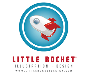
Personal identity logo for personal website - one of several different designs.
As seen on:
Little Rocket Design
Status:
Nothing set
Viewed:
3015
Share:

Lets Discuss
Fun. Why no flames?
Replyfirst of all... nice icon drawing. I really liked your rocket. But i think you gotta do something about your type mate. Because the square and type dont have any relation neither as size nor as shape. So, maybe you dont even need the sqaure frame. This way the rocket dont seems %22little%22 :)**peace
ReplyI actually like the type. But the rocket seems a bit BIG to me.
ReplyI feel like the enclosure is what's making the rocket seem too big. Do you even need it? In addition, do you need all that text? Just the 'Little Rocket' text would look much better. Or perhaps do away with the web address. Just my opinion anyways. Nice job all together.
ReplyNice illustration but too much type stacked together!
ReplyThank you all so much for the advice! I ended up not using this logo, much for the same reasons pointed out above. It really ended up not conveying what I needed it to, but thank you all so much for your valuable input!
ReplyPlease login/signup to make a comment, registration is easy