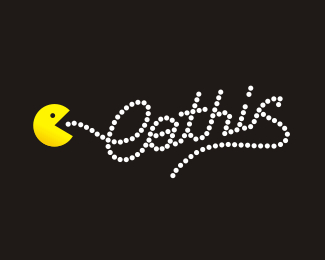
Description:
I'am looking for some concept for my private website (machola it's my last name) but i'am not conviced for this idea. What do You think?
edit: colors and details upadated
Status:
Nothing set
Viewed:
2185
Share:


Lets Discuss
hi, id lose the cursors and the line at the bottom. Centralise the logo, make machola heavier.
ReplyHm... machola... %3D macho la :) %3D la macho :))) Now you design some action-macho-designer-man for mark or something similar... Or some bold %22macho%22 type only. :) That is my try :))) GL
ReplyPlease login/signup to make a comment, registration is easy