Float
(Floaters:
1 )
Description:
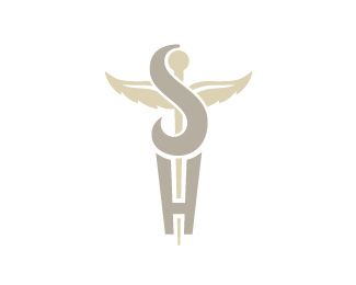
Logo for a nurse staffing/placement agency.
Status:
Nothing set
Viewed:
2777
Share:



Lets Discuss
I love the concept, but I believe the S and H should be a smidge thinner. That would help the logo be more elegant. Adding more of a head to the snake would give the S the added to detail to balance better with the graphic winged staff behind. It just seems as though that winged staff, although in the background and lighter in color and weight, is stealing the spotlight from the SH a whole lot.
ReplyPlease login/signup to make a comment, registration is easy