Float
(Floaters:
12 )
Description:
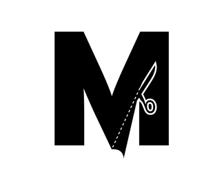
Logo for a maker of custom mens trousers.
Status:
Nothing set
Viewed:
4267
Share:



Lets Discuss
This is definitely a fantastic idea. I'm wondering if you could scale up the scissors a tad? Also, perhaps if you change the cut flap to a grey, the mark will have a little more depth. Just some thoughts. All in all, nice job.
ReplyAbsolutely love it. Saw this in LL3.
Replya work of genius... although as Oc said slightly bigger scissors would be worth looking at.
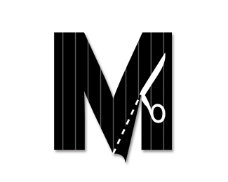
ReplyLeighton what if you just reversed out the scissors in white from the M, then do as Oc suggested make the flap a gray or pinstripe. Love the concept. Just concerned about the line weight at small sizes perhaps on a custom embroidered tag.
ReplyPin striping would be really neat.
Replyscissors reversed out in white is a good idea Bart
ReplyNice idea! I wonder if u try to integrate the scissors in the middle of the %22M%22, the outcome of this is could be two trousers?! Not sure if it work so well like this one! I like it anyway!%3B)
ReplyPlease login/signup to make a comment, registration is easy