Float
(Floaters:
3 )
Description:
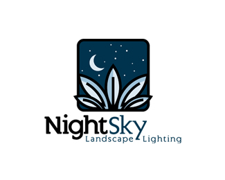
Logo for a landscape lighting company.
Status:
Nothing set
Viewed:
4827
Share:



Lets Discuss
the lines that split the leaves could be smoother and the type isn't really working with the mark. but it has a nice feel overall.
ReplyFeatured here:
Reply20 Creative Moon Logo Designs for Inspirations
Thanks for the blog post inclusion and notification. It would be nice if other bloggers bothered to do that, especially when most of them don't even link back to the designers. Lots of orphan works out there because of it.
ReplyI appreciate it.
Please login/signup to make a comment, registration is easy